
 |
| EDA, John Tukey, exhibit 4 of chapter 2 |
"the editorial principle that nothing should be given both graphically and in tabular form has to become unacceptable" - John W. Tukey
Back to school
In the United States, most fifth grade students are learning about a fairly powerful type of visualization of data. In some states, it starts at an even younger age, in the 4th grade. As classwork and homework, they will produce many of these plots:
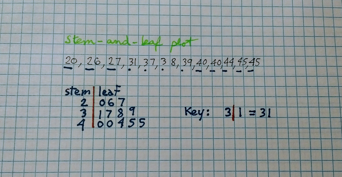
They are called stem-and-leaf displays, or stem-and-leaf plots. The left side of the vertical bar is the stem, and the right side, the leaves. The key or scale is important as it indicates the multiplier. The top row in the image above has a stem of 2 and leaves 0,6 and 7, representing 20, 26 and 27. Invented by John W. Tukey in the 1970's (see the statistics section of part II and the classics section of part V of my "ex-libris" series), few people use them once they leave school. Doing stem-and-leaf plots by hand is not the most entertaining thing to do. The original plot was also limited to handling small data sets. But there is a variation on the original display that gets around these limitations.
"Data! Data! Data!"
Powerful? Why did I say that in the first paragraph?
And why should stem-and-leaf plots be of interest to students, teachers, analysts, data scientists, auditors, statisticians, economists, managers and other people teaching, learning or working with data? There are a few reasons, with the two most important being:
- they represent not only the overall distribution of data, but the individual data points themselves (or a close approximation)
- They can be more useful than histograms as data size increases, particularly on long tailed distributions
An example with annual salaries
We will look at a data set of the salaries for government employees in Texas (over 690,000 values, from an August 2016 snapshot of the data from the Texas Tribune Salary Explorer). From this we create a histogram, one of the most popular plot for looking at distributions. As can be seen, we can't really tell any detail (left is Python Pandas hist, right is R hist):

It really doesn't matter the language or software package used, we get one very large bar with almost all the observations, and perhaps (as in R or seaborn), a second tiny bar next to it. A box plot (another plot popularized by John Tukey) would have been a bit more useful here adding some "outliers" dots. And, how about a stem-and-leaf plot? We are not going to sort and draw something by hand with close to 700,000 values...
So how does it look for the same data set?

Now we can see a lot of detail. Scale was automatically found to be optimal as 10000, with consecutive stems ranging from 0 to 35 (350000). We can read numbers directly, without having to refer to a color coded legend or other similar approach. At the bottom, we see a value of 0.00 (who works and is considered employed for $0 annual income? apparently, quite a few in this data set), and a maximum of $5,266,667.00 (hint, sports related), we see a median of about $42K and we see multiple classes of employees, ranging from non managerial, to middle management, upper management and beyond ($350,000+). We've limited the display here to 500 observations, and that is what the aggregate count on the leftmost column tells us. Notice also how we have a convenient sub-binning going on, allowing us to see which $1000 ranges are more common. All this from one simple display. And of course we can further trim, zoom, filter or limit what data or slice of data we want to inspect.
Knowing your data (particularly at scale) is a fundamental first step to turning it into insight. Here, we were able to know our data a lot better by simply using the function stem_graphic() instead of hist() (or use the included stem command line tool - compatible with Windows, Mac OS and Linux).
Tune in next episode...
Customers already using my software products for data governance, anomaly detection and data quality are already familiar with it. Many other companies, universities and individuals are using stemgraphic in one way or another. For everybody else, hopefully this has raised your interest, you'll master this visualization in no time, and you'll be able to answer the title question affirmatively...
Stemgraphic has another dozen types of visualizations, including some interactive and beyond numbers, adding support for categorical data and for text (from version 0.5.x onward). In the following months I'll talk a bit more about a few of them.
Francois Dion
Chief Data Scientist
@f_dion
NB: This article was originally published on LinkedIn on March 7 2018: "Are you smarter than a fifth grader?"
Comments
Post a Comment